
Founded with a visionary perspective and with the urgent need to develop a service that initially complemented the activity of the metalworking, one of the main economic activities of the region of Aveiro.
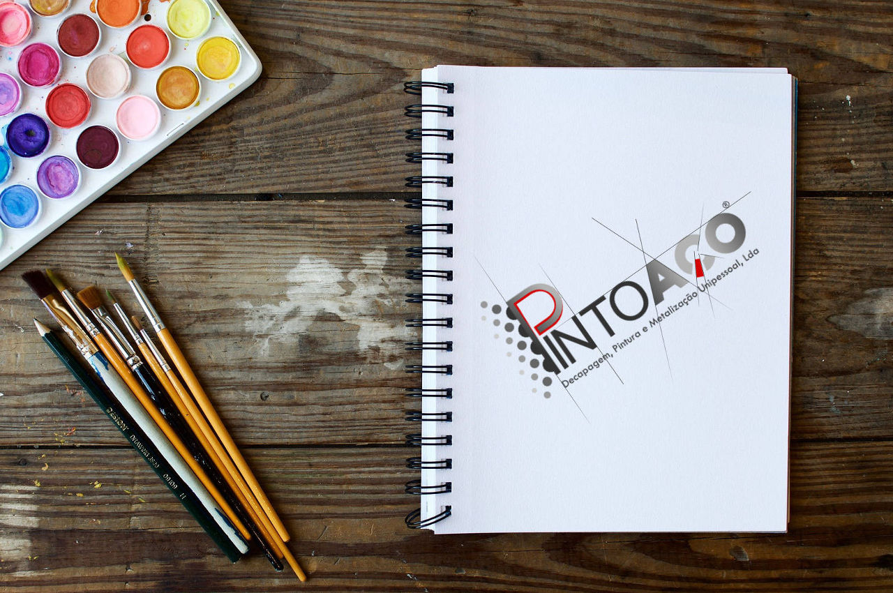
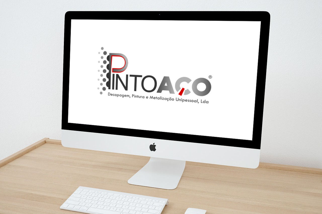
In seeking a more current image and transmitting what is done by the company, we create a logo that represents the raw material used, the steel and the transformation that is made to it.
The sans serif and thin font in the word "Pinto" creates contrast with the word "STEEL" giving it even more strength, such as the raw material used. Based on the work of painting, the "P" has a dual function, word construction and design, being the allusion of a spray gun.
Being this creation the redesign of a logo used for several years ago by the company, we kept the red color and is present in the two key representations of the company, the painting and the raw material.
Client:
PINTOAÇO - Decapagem, Pintura e Metalização Unipessoal, Lda